Hi 'Scapers,
We recently visually updated the core Pernix armour, and offered the original "Retro" variant as a free unlock to players who equipped the relevant armour piece to their character. We were super excited to be able to visually update the armour while also preserving the original set for you to enjoy!
However, the feedback we received from many of you, across various platforms, was heard loud and clear - this design was a departure from the original and you felt that some of the identity of Pernix's armour had been lost in the process of creating this new updated version. We've taken a lot of feedback on board from across our platforms and it's been incredibly helpful to receive constructive and insightful explanations about the things that stood out to you most when seeing our new design.
We've sat down with a range of JMods from across the team (some of whom have been rocking Pernix armour for a decade!) and we've explored our options of how we can take your feedback forwards and make adjustments to the armour.

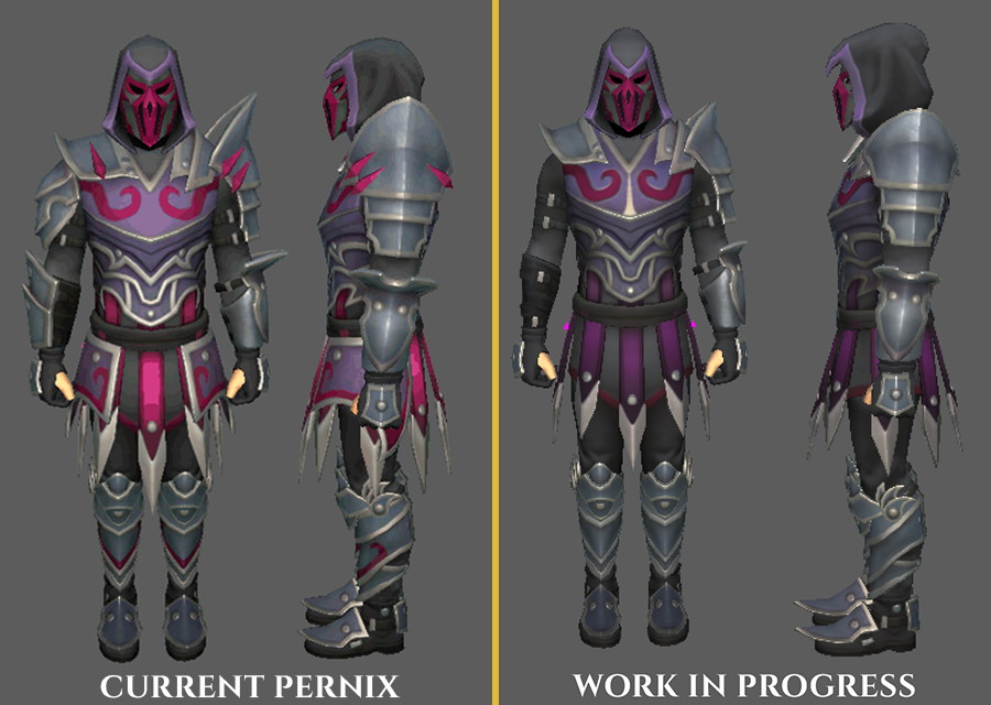
On the left, you can see the current Pernix armour with its updated visuals. Over on the right is our current WIP concept that the team are working on.
We've taken the chance to tackle a few crucial points of feedback on this:
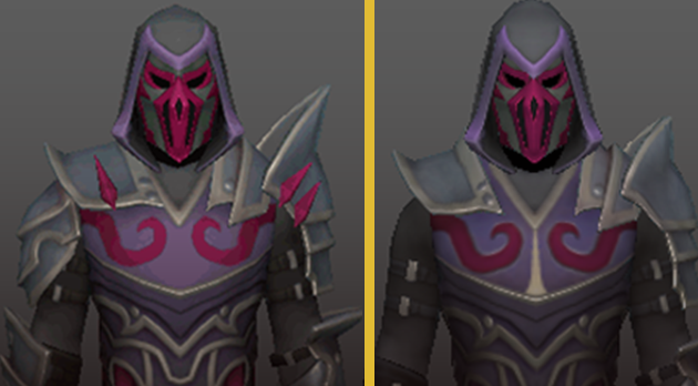
- Cowl: the hood more prominently hangs over the mask, and the silhouette is sharper and more angular, being slightly less form-fitting.
- Sleeves: We'd drop the armour from the right arm, to make the armour more lithe, agile and sleek.
- Pauldrons: We're looking at both pauldrons, dropping the angle of the left pauldron for a clearer line of sight when firing, and restoring more of the asymmetry.
- Torso: The Retro Pernix silver cross on the chest is back, and we're looking to accentuate the markings across the breastplate.
- Thighs: We're looking at removing the plating on the thighs, offering a broader range of movement and mobility for the wearer.
- Boots: The silver points from the Retro set would be back to better accentuate the detailed trim of the boots.
- Skin: We heard you on this one, and we feel that the visible skin, while offering more maneuverability and forgoing protection, didn't quite look right. We've elected, here, to have the dark cloth beneath serve to accentuate the colours within the armour and make them pop a little more.
We are making great progress on this adjustment, but we really wanted to take this opportunity to reach out to the community and "show our working" in how we acknowledged the feedback we've received and how it's informed the decisions we're making.
We're looking forward to getting this updated version into your hands in the coming days and want to thank you all for the constructive feedback we've received in this process.

