Mobile Dev Blog - June

Hey Folks,

The time has come for another Mobile Dev Blog!

Mobile & Desktop UI

Since we last raised the Android beta cap we have been busy looking into the feedback players have provided as well as analysing how players new to RuneScape find the game to play.

This has lead us to the conclusion that, whilst the game is performing well for existing players, if we want to make the most of the influx of new players we will reach via the mobile platform the we need to make some wider changes to the UI.

The reasons for this are two-fold;

  • Many Mobile players will end up playing on the desktop client too
  • Looking at the launch of OSRS mobile, we see a significant proportion of those brand new mobile players also playing on desktop. As it stands right now the UI on RS Mobile is significantly different to the UI on RS Desktop. If we want these new players that find the game via mobile devices to feel comfortable playing when they get onto the desktop client, then we need to make sure that the experience across both platforms is familiar.
  • We don’t want to support another UI mode
  • If we introduce another UI mode for mobile devices then we end up introducing another layer of checks and development process that will increase the workload of the teams creating content for the game. This extra layer of development process and QA testing requirements will slow down and complicate the process of creating content for the game. Not a good situation.
  • So, what does this actually mean? It means that we’re going to be doing a fair bit of work to unify the UI style between Mobile and Desktop. They won’t be exactly the same, as the way players interact with the game on both platforms is different but, the closer the UI on both platforms is, the easier it is to develop content for the game and the easier it is for players to transition from mobile to desktop and vice-versa.

    We’re in the process of properly defining what the UI will be, but have made a few small steps towards this end. Where possible we’re going to be making changes that we feel are good for BOTH platforms where possible. A good example of this is the new Worn Inventory interface layout shown below;
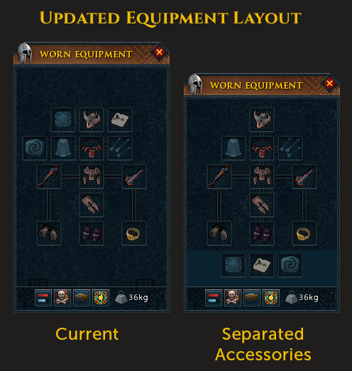

    The things we kept in mind when designing the new layout were;

  • Back when the sigil slot was first added we received negative feedback from players, specifically about where it was added in the classic ‘tree’ equipment layout. Not only did it expand the required width needed for this interface but there may have been other places to add it and avoid it looking like it was just “tacked on”.
  • On mobile, we currently cannot use the classic ‘tree’ layout because it is slightly too wide with the sigil slot in its current position. Changing this will let us use the more familiar layout, instead of having to use a grid layout that can also make the worn equipment look like the backpack at a glance.
  • For many long-time lapsed and returning players (and even Old School players moving to RS), a few new equipment slots have been added over the years. While the core of this interface has not changed, these new slots can reduce the familiarity to them. But this change helps retain the traditional structure for all the slots shared across both games.
  • For new and low-level players these slots are not relevant until the mid to late game. Grouping together these slots will help make the equipment interface feel less busy and intimidating for these players. This also helps separate these more (mostly) consumable item slots from more permanent armour, weapons and cosmetic slots.
  • However, doing this change will mean that this layout will now be taller (possibly affecting top-level interface layouts), and the position of some regularly used slots will have moved.
  • As you can see from the list above for this relatively small change, there are some potential drawbacks. It’s going to be hard to update the UI to please absolutely every single player, but we’re going to be doing our best to make sure that we make holistic changes that are useful to all of our players (new & existing, mobile & desktop) and part of this process is going to involve the community as we reach out to you to get feedback on proposed changes. Expect to be hearing from the Community and Development teams in the near future!

    Buff/Debuff Bar

    The current buff and debuff bar system wasn't really optimal for mobile, as a result we've taken this opportunity to make the following changes to the system, these will also be visible on desktop

  • The buff and debuff bar system has been totally re-written
  • Buffs are now ordered in priority order placing more important buffs at the front of the buff bar this should react accordingly to buffs coming and going
  • The buff/debuff bars can now resizable to a minimum size of:
  • 1 buff wide
  • 1 buff high
  • Here you can see when the Grimoire is activated it takes priority based on its "importance" (the scrimshaw slot)

  • Potions and summoning pouches now do the following:
  • 30s left - bump their priority up the list
  • 10s left - bump their priority again and flash
  • And here you can see the see how the potions and familiar icon bump up based on their timers remaining with a small flash for icons with 10 seconds remaining

  • The maximum trackable buffs for the buff bar and debuff bar now goes to 50!
  • Finally enjoy this glorious view of a resized buff bar and debuff bar to however you want, alongside all of the icons!

    Actionbars

    We know that there are not enough action bars, so in the spirit of cross-platform we're now giving all users an additional three action bars to use across mobile as well as desktop!

    Future Release Plans

    On to the hot topic of betas! We will be aiming to uncap the Android Members beta in the near future so, if you’re a member and have an Android device, you’ll soon be able to play on mobile and not have to worry about getting in before the influx of other interested players.

    As for iOS; we are still developing the iOS version but are not in a position to release a beta at this point. We need to work on a few stability issues and then focus on the best way to get it into your hands. However, the way betas are organised on iOS means that we wont be able to run the same kind of beta we did on Android. We know that there are many players eager/frustrated to get their hands on the iOS version, and we’re just as eager to give it to you! Once stability of the iOS version is up to scratch and we’ve come up with the best way to get it to you, expect to hear more.


    Mod Liam and the Mobile Team
    Back to top