We've been quiet since our last mobile playtest (May 2018), and we hope this newspost will give you a look into how our last playtest went, what we've taken from that and what you can look forward to as we go forwards!
Mobile Playtest Feedback (May 2018)

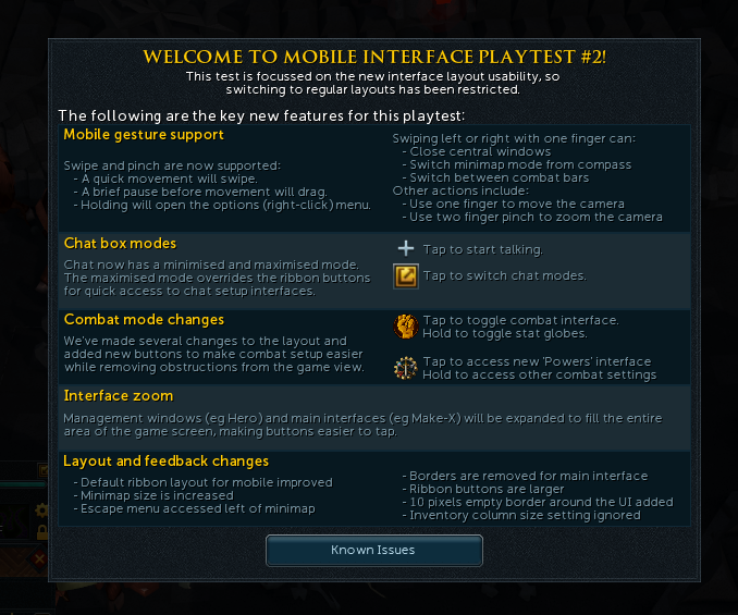
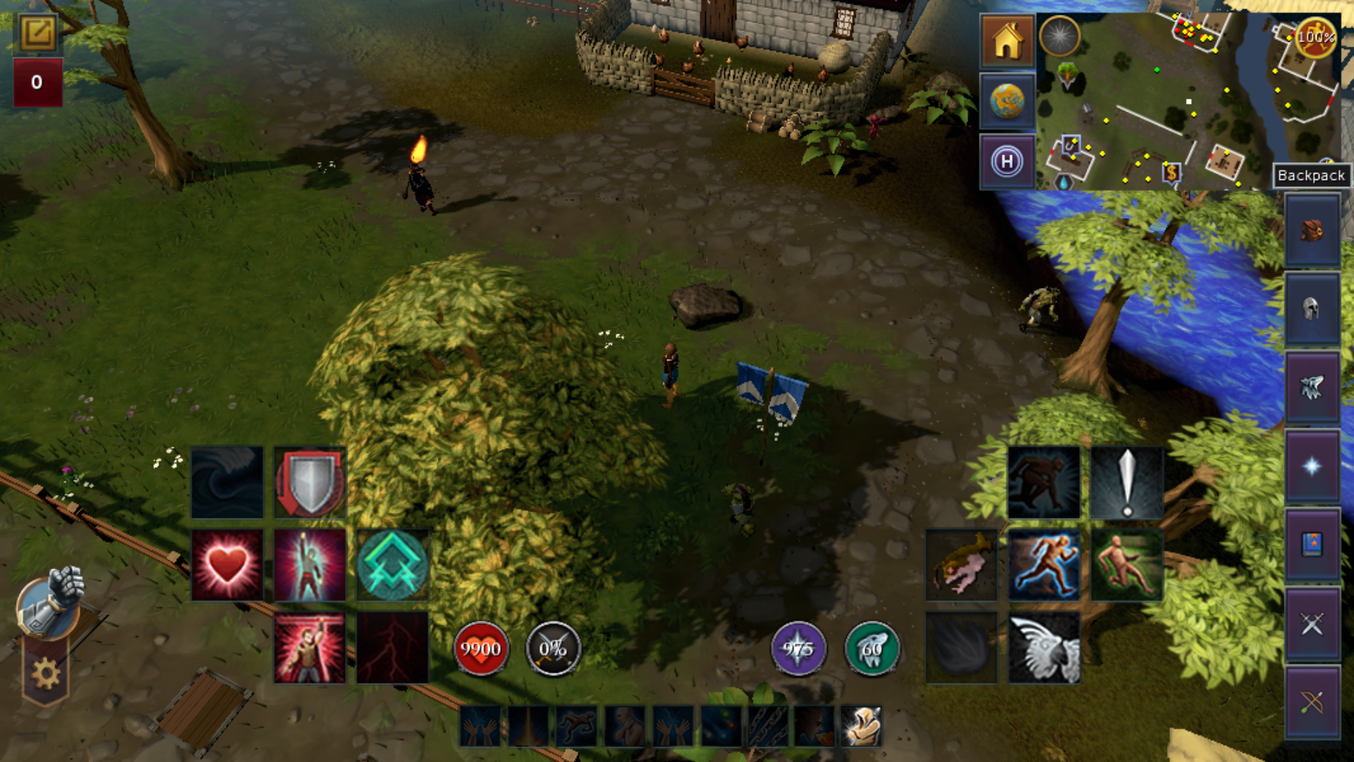
The screen presented to testers who took part in playtest #2 (May 2018)
From May 3rd to May 14th we ran a playtest across iOS and Android devices. This was the first time in RuneScape Mobile we ran a test across both platforms and there was a lot to digest.
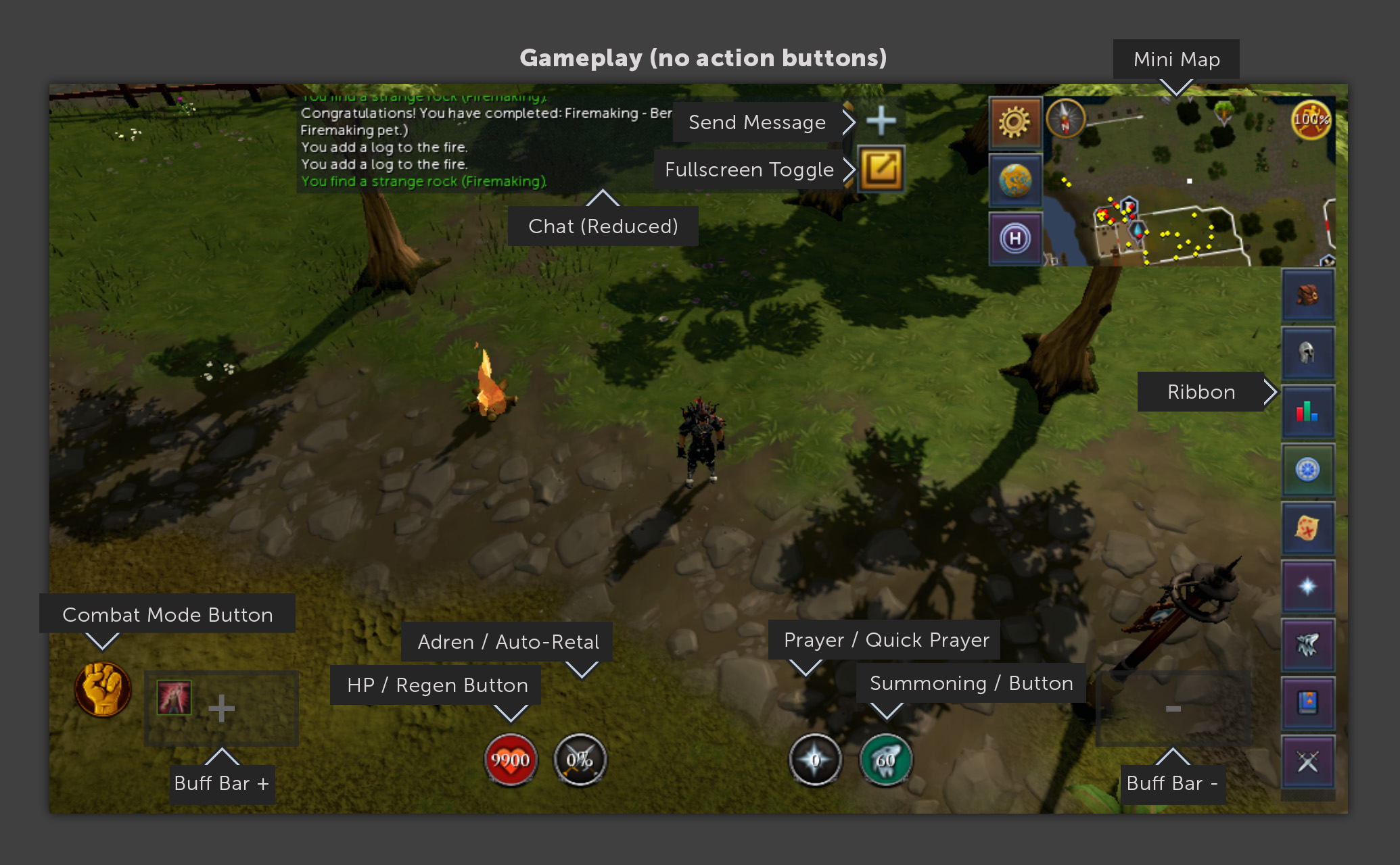
In this playtest we introduced 'Mobile gesture support' allowing our testers to use swipe and pinch functions for the first time. Alongside this came chatbox & combat mode changes, removing obstructions from the game view, finally we expanded some interfaces to make it easier to interact with on mobile.

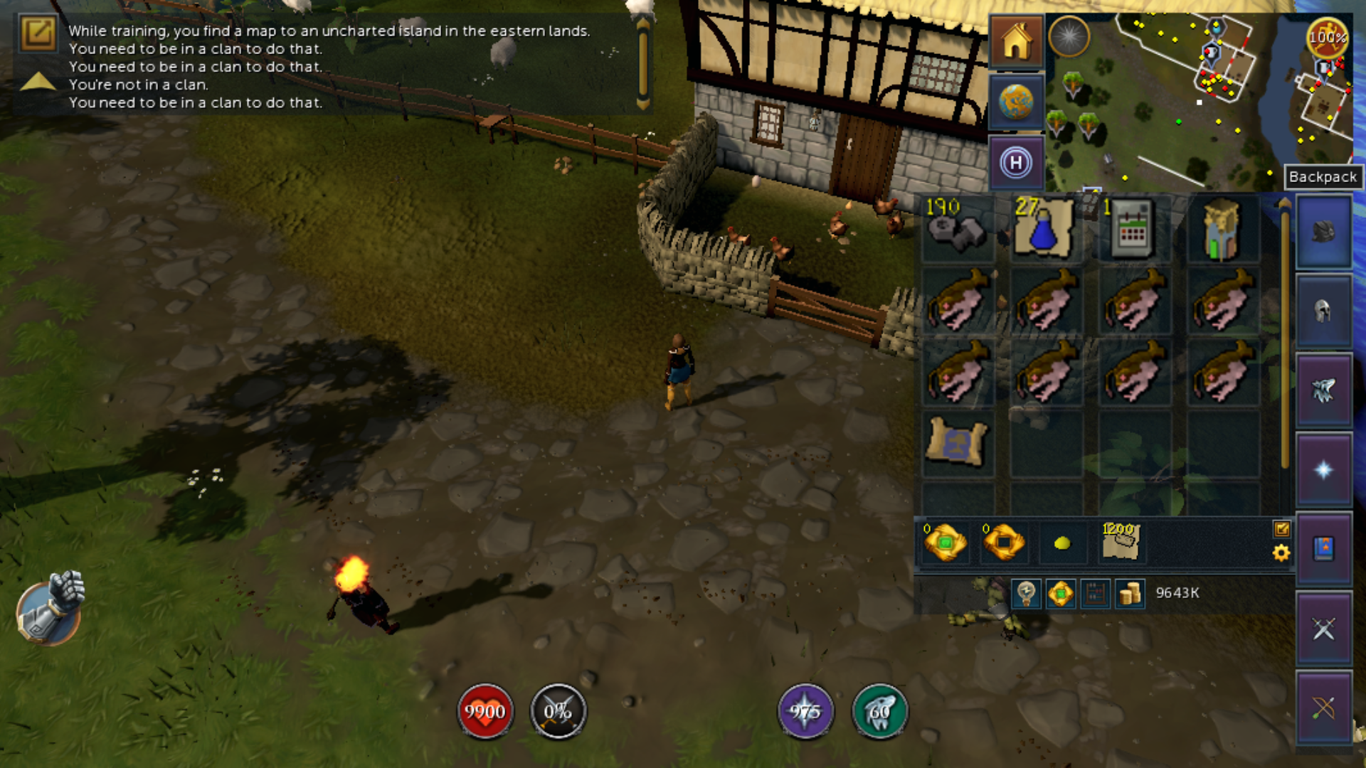
The in-game mobile interface that testers from Playtest #2 saw.
Upon completion of the test we sent out a survey to our testers. We wanted to find out stats from the testers we invited to test. From this, we found out the following.
55% played the beta on iOS devices, with 45% on Android.
77% play mobile games daily, with 91% at least weekly.
87% also play RuneScape regularly:
8% of respondents have not played regularly within the last month.
Most have been playing RuneScape for over 6 years, with only 4% starting within the last 5 years.
The top 5 RuneScape activities on mobile were:
Skilling
Combat (Slayer)
Combat (Bossing)
Clue Scrolls
Quests
Revolution was the preferred combat style (82%).
The top five activities all hit the mark. We fully expected most testers to use mobile for skilling and we were additionally pleased to see some testers even attempting to boss on mobile.

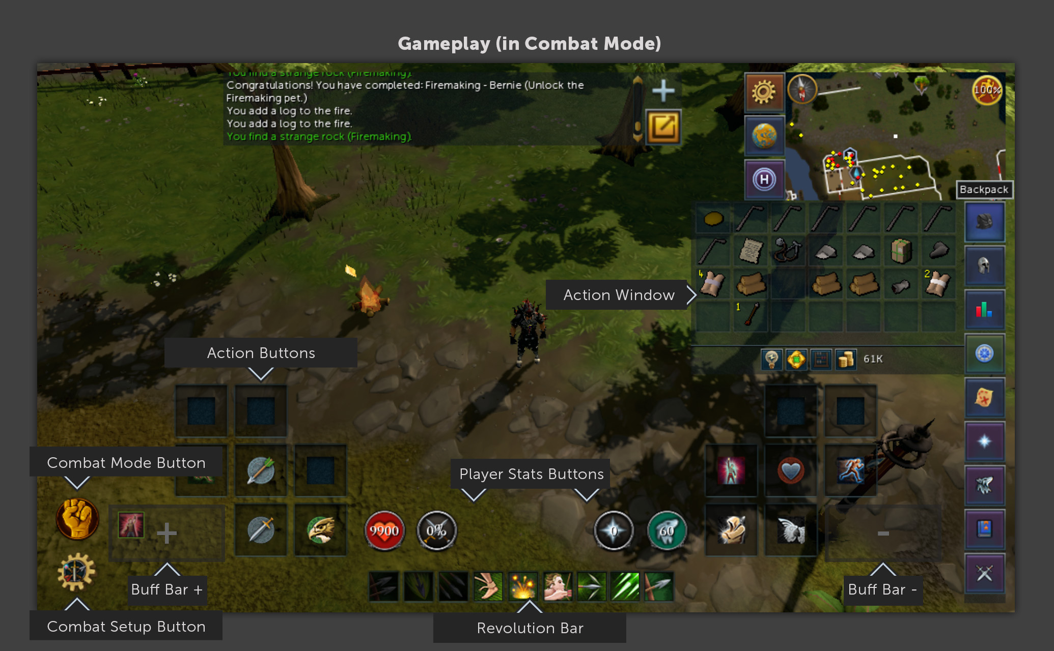
The "in-combat mode" buttons that testers saw in Playtest #2
We then asked testers to give us ratings based on the following points. Here are the overall results from all of those who completed the survey (scored out of 5):
Interaction - 3.70
Camera Controls - 3.99
Interaction Menu (mini menu) - 3.11
Mini Map - 3.61
Chat - 3.36
Combat - 3.11
Overall, testers rated RSM's interface - 3.84
Finally we wanted to get an idea of player expectations based on mobile gameplay. Here's what we got back from the testers.
The following are the main areas testers said they'd be satisfied to play regularly on mobile:
Skilling - 97%
Combat (general) - 55%
Chatting with friends - 46%
Trading - 40%
Combat (low-level bosses) - 36%
The following are the main areas testers said didn't meet their expectations on mobile:
Chatting with friends - 53%
Combat (high-level bosses) - 42%
Combat (general) - 26%
Dungeoneering - 25%
Quests - 23%
Your insight was extremely valuable - by directing us to the potential issues you were facing, it indicated where we should focus on improving the Mobile experience. there's only so many issues we can identify ourselves, and putting it in the hands of our testers allowed us to see what issues they had so we could focus on them.

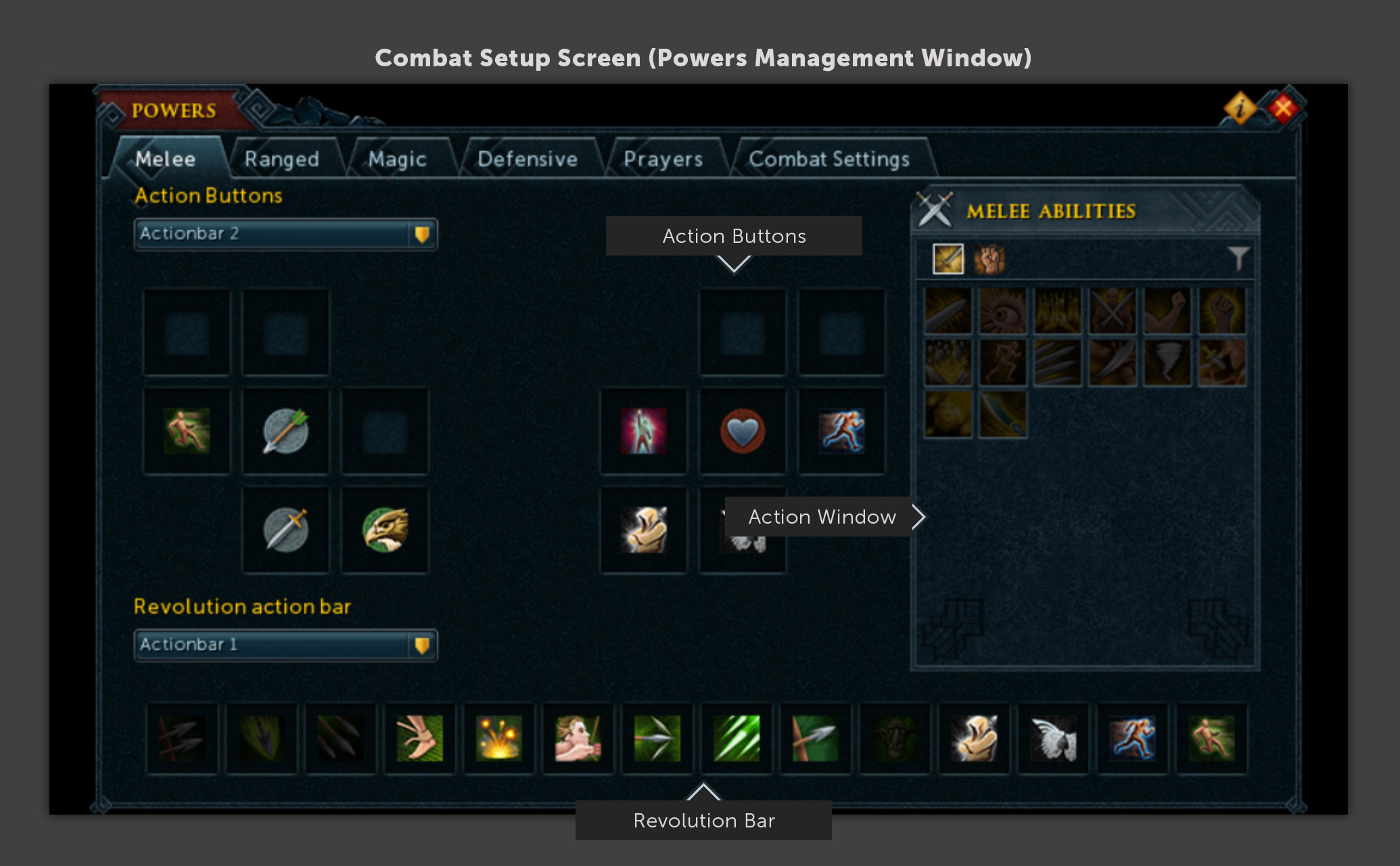
One of the examples of a "full screen" mobile friendly interface from Playtest #2
After collating all of the feedback we prioritised on-going development based on these results:
Mini Menu: Too small to interact with - Increase size, resolve finger blocking options.
Chat: Investigate and develop on chat interfaces:
Re-add ability to change chat channels
Easier way to respond on mobile to PMs.
Add a way to 'Always-on' chat.
Bank: Preset buttons are too small.
Grand Exchange: Couldn't use interface due to keyboard blocking search
Child Window: Size of inventory slots and abilities slows interaction (too small). Easier Alching and Disassembling required.
Combat setup improvements: Allow testers to access the inventory, worn equipment, items and prayers easier.
Combat TLI (Top-Level Interface): Interaction responsiveness and setup raised.
World Map interface: Add margins to interface (bezel and notch issues).
Device System interaction: Causing game to lose function.
Keyboard: Huge source of frustration - Improve open/close gestures.
TLI (Top-Level Interface) & interface margins: Accommodate bezels and iPhone X-style notches and home buttons.
TLI(Top-Level Interface) layout: Ribbon and investigate reduction of TLI (Top-Level Interface) buttons.
Quests: We'd investigate what might be causing lower confidence scores than expected.
So, what's next?
So that's what we've discovered since our May 2018 test. Now, let's get to the exciting bit. Here's what we've done since that May playtest, and what we're currently working on.

What RuneScape Mobile currently looks like (work in progress).
Mini menu
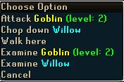
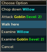
Changes to adapt the mini menu for mobile have required a huge overhaul by the Tech team. The changes will now allow the content teams to make changes to the visual appearance, and have more control on what and how information is displayed.
Still work to do but we�re getting close to it being testable.
This is one of the key areas that will transform the RS Mobile experience, and is key to a more permanent closed beta (always on).
Dropdown menu options have also had the height increased to be easier to tap.


The current mini menu in the LIVE game versus the mobile-friendly mini menu.
Chat
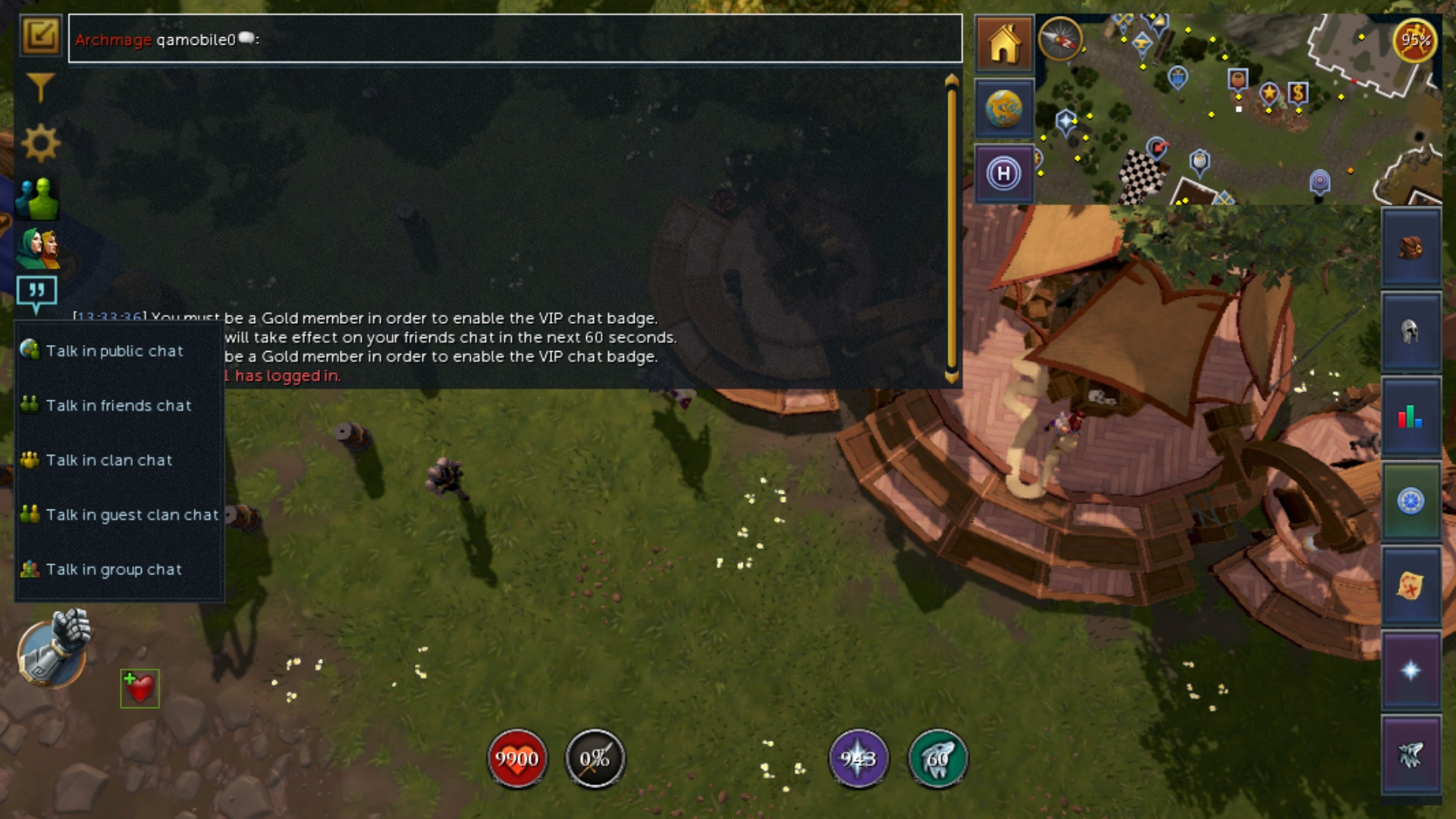
Rearranged chat to be in the top left.
Added a �Reply to PM� button after player feedback.
Added a button to swap between the standard and social ribbons.
A fullscreen version of chat was removed, and a fully minimise chat has been readded with message notifications. We made certain messages that might be considered spam no longer trigger a notification on mobile.
Providing an easier way to change between chat channels was a known issue which we have now addressed.
 The chat channels in action on Mobile
Bank and Grand Exchange
Bank � Increased size of bank preset buttons.
Grand Exchange � Moved position of the search box so it is no longer hidden by the Keyboard
Settings Interface Rewrite
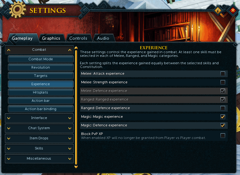
In making sure we want to make our interfaces as mobile-friendly as possible we've completely revamped the Settings menu - check out the work-in-progress screenshot below!

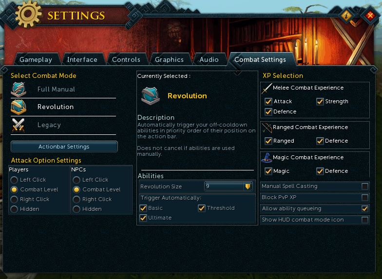
The current LIVE combat settings menu.

And... the mobile friendly version! Integrated into the Settings interface.
Ribbon, Backpack and Action Windows
Testers identified size of clickable components as something they wanted to improve on mobile.
We've made the following improvements as a result of this:
Increased slot sizes of the backpack, worn equipment and ability books.
Larger text where possible, including Friends list.
Larger buttons on the ribbon.
The height of child windows now adapts if the mini map and/or combat mode is hidden.

The larger ribbon and backpack in action for easier button pressing.
Combat
Target switching - This is a feature that'll allow you to enable the targeting system, in this you can toggle between a variety of settings and will be available to mobile as well as desktop users.

The target switching menu, available to everyone on desktop soon!
To give you an idea of how it works check out the gif below!

World Map
Testers were getting stuck on the World Map on certain devices. The buttons have been moved away from the edges to prevent this.
NPC Dialogue
Advancing through chat dialogue is no longer restricted to clicking the continue button, you can now click anywhere within the area where the button to advance dialogue is.
Optimisations
Ongoing performance, battery use and device specific improvements. These should help reduce how hot the phone battery gets when playing RuneScape.
Improvements to how the app deals with connections and the amount of data use.
Resolved a major bug on mobile where some actions would stop any audio from playing.
We've also being going through and fixing the game cache (the cache is the game data we use for RuneScape on your mobile), with this we've been clearing out old/unused archives.
Fixes for crashes.
Contexual Keyboards
We�ve started work on showing different keyboards depending on what the expected input should be. So, for example, an input field for a quantity of items would show a numpad keyboard.
A major issue when interacting with the device or notifications that could cause any inputs to only affect the camera has been fixed.
Login screens now moved to accommodate keyboard. This should now show the 30-day Authentication on most standard devices.
While the technical challenges of bringing RuneScape onto Mobile have been huge, we are getting closer by the week to having an experience that feels satisfying.
Recent changes have had a huge impact on this, but there are several areas still to look at. We will be looking to run some more small beta tests in the near future, but there are still a number of areas to work on before we can be happy to give a date for an always-on closed beta.
We know you�re all eager to have RuneScape Mobile in your hands, and will keep you updated about any future playtests.
The RuneScape Team
